


Techniques for Working Textures Into Your Photography
 Where do you begin when you are considering using textures in your photography? I suggest you begin with the absolute best photo possible. Adding a texture to a bad photo does not make it a good photo. You want to make sure you have it exposed correctly, composed well, have a clear subject and not too much in the competing in the background competing. Textures work best with photos that are not too busy to start. Once I have chosen the photo I am going to work with, I do all of my edits before I add the texture, including adjusting the colors and sharpening.
In this article I’ll share some of my techniques for working textures into your photography.
Sharpening your image
You want to sharpen your photo before you add the texture. This is so that your subject is sharp and the texture isn’t over sharpened compared to the subject. You want the texture to enhance your photo, not compete with it. When I sharpen the photo I use the high pass filter as opposed to the unsharp mask. I like this method best because it defines and clears up all the edges of your subject without over-sharpening all the fill areas. Below is how I do this and the settings:
- Duplicate your background layer and while that duplicate copy is still highlighted, go up to the Filter menu and select: Other > Highpass filter
- Set the filter radius between 6 and 10 pixels (or higher) depending upon how sharp you need to have your photo, but be careful not to over sharpen.

- Next change the blending mode of this layer to “Softlight†or “Overlayâ€. Overlay is stronger than Softlight, so test out each option to see what works best for your image.
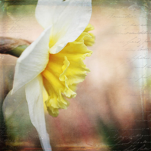
Finished image with texture and vintage paper applied
Once I am finished adding my textures to the photo I might do a final sharpen at the end if needed.
How to erase texture and still retain tone, plus a few extras
Once you are finished with your edits and sharpening, you are ready to add the texture. One concern people have in adding texture is how to erase the texture from the subject without it being obvious. You wouldn’t want to have the face of a baby be texturized, for instance, but you would want the face to match the rest of the photo in color and tone.
5 Steps:
- Place the selected texture on your photo. Do this by going to: “File > Place†in the top menu. Then select the texture image you want to use. It opens up as a new layer on top of your photo, ready to resize. Do that, then I right click the texture layer and choose “rasterizeâ€, so it will no longer be a Smart Object. Change the blend mode and opacity of the texture layer to suit your image, such as “Softlight†or “Overlayâ€. At this point you are just manipulating the texture and not worrying about erasing it yet.
- While the texture layer is still highlighted, there are a few techniques you can do to the layer before you move on. Adjust the levels, curves, and the saturation of the texture layer to make the texture more vivid or pronounced, but not more opaque. I work in Softlight mode a lot as it brings out some of the texture without changing the mode.

- Once you are happy with the way the texture is working with the image, duplicate the texture layer and apply a Gaussian blur set to about 60 pixels to the bottom texture layer so it gives you the exact tones of the texture. Get to the Gaussian blur box by going to “Filter > Blur > Gaussian blurâ€. Next, turn off the bottom layer that you just added the blur to.

- Add a mask to the top layer. With a soft black brush, set to about 30% opacity, ybegin to brush off the texture in any areas where you don’t want it. By using a low opacity you can slowly build up the amount you are removing. If you remove too much simply change the brush to white ,and wipe some of the texture back on. Make sure while you are doing this that you have the mask box selected (it will have square brackets around it) not the image itself.

- Once you are happy that the texture is removed from all the important areas – select the mask box, hold down “Shift + Alt†and drag the mask box from the top texture layer to the bottom texture layer. Now you have applied the mask to the blur layer, and you have inverted it at the same time. Turn that layer back on and you will notice the tone where you erased the texture has the same coloring as the rest of your photo.

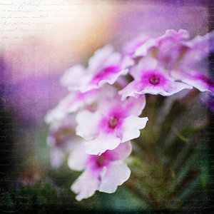
Using vintage papers in your photography
Working with vintage papers is another fun aspect of textures that you can use in your photography. I get vintage papers from several great sources including my own family documents from the mid 1800’s, flea markets, online searches, Etsy, etc. I have curated several collections on my website for sale if you don’t want to go through the trouble of searching for them yourself. I especially love vintage French papers because of their wonderful scripts, markings, and fancy headers.
Part One
Working with the vintage papers is the same as working with textures. Place the paper on your photo in the approximate location that you want to use it. You will notice in the sample that I have placed it on the top of the many textures I have used in this photo, but you can place it on any layer that you want, to get the look you are trying to achieve.

Part Two
Next, adjust the layer using the darkening blending modes: darken, darker color, color burn, linear burn, and multiply. Experiment with them all to see which one works best on the photo. The goal is to make the paper part of the document disappear, and have just the writing remain. Then just adjust the opacity to suit your taste. You can add a mask to this layer if you want to strategically erase some of the text which I do quite often.

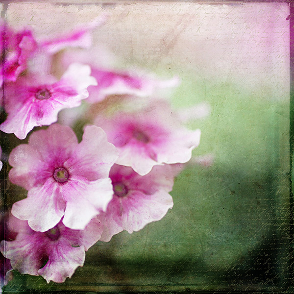
Finished image
I hope you will give some of these techniques a try whether you are new to textures or have been doing them for years. If you do, please share in the comments below!
Further reading on using textures in your photography:
Source Article from http://feedproxy.google.com/~r/DigitalPhotographySchool/~3/vojcUMEnY1w/techniques-working-textures-photography
 Started out doing photography at the age of 6 using an uncle's old 1940 kodak brownie box camera. At 15 years of age, I decided to buy my very own 1975 Praktica SLR camera. I now shoot with a Nikon D850. I do unpaid TFP and commercial paid work.